Le maglie più belle dei Mondiali 2026: cinque divise che fanno già storia
Trends

Introduction
Some people watch the World Cup for the goals, some for the tactical drama. We watch it for the kits.
And the 2026 World Cup doesn't disappoint on that front: brands like Adidas, Nike and Puma have turned national jerseys into genuine cultural statements, where design speaks to the history, landscapes and identity of each country.
In this article, we've picked five kits that, in our view, hit harder than the rest. Not just pieces of sportswear — objects that actually say something, and say it with a style that works well beyond the pitch.
The design of World Cup kits: why it matters more than ever
A football shirt isn't just a uniform. It's the primary visual vehicle through which a national team presents itself to the entire world — for a month, in front of billions of viewers.
It's no coincidence that in recent years the major sportswear brands have turned national kits into full editorial projects: every colour choice, every graphic motif, every typographic detail tells you something about the nation it represents.
The 2026 World Cup, hosted across the USA, Mexico and Canada, is no exception. Several brands have put forward collections where the aesthetic dimension is inseparable from the narrative one.
The result? A parallel competition — one of design — that kicks off before the opening whistle.
Belgium – Away kit (Adidas): Magritte takes the pitch
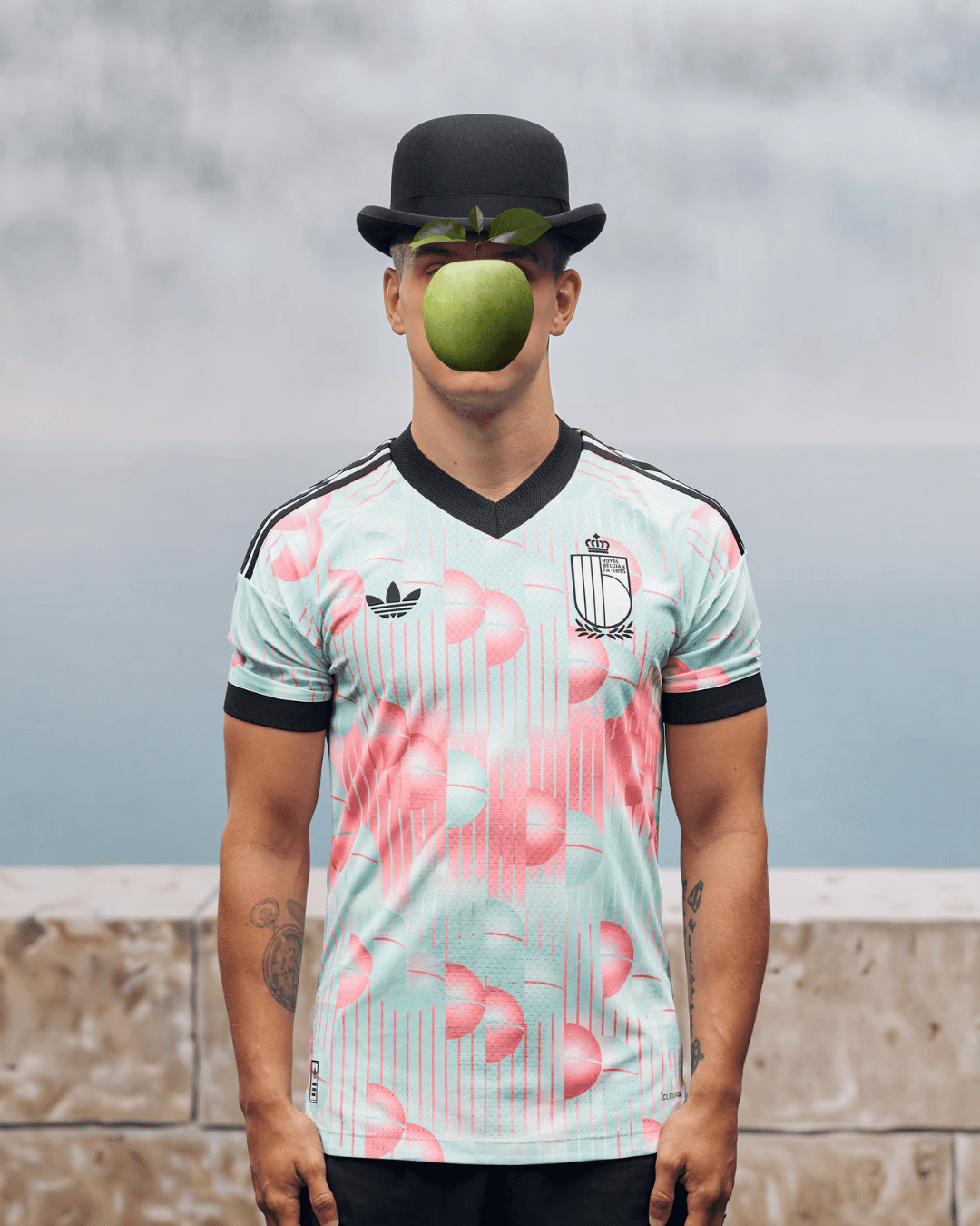
If there's one shirt that perfectly captures the idea of "national identity translated into fabric", it's this one.
Belgium's away kit for the 2026 World Cup features a sky-blue design — called Frozen Blue — with a spherical block pattern and carbon, white and light pink details.
The overall effect calls to mind soap bubbles, or more precisely, spheres floating in an undefined space.
A surrealist aesthetic — and not by accident. The detail that sparked the most conversation is the slogan printed on the inside of the collar of the replica version. It's a clever play on words inspired by René Magritte's famous surrealist work, "The Treachery of Images." The authentic version worn by players doesn't feature this element, due to strict FIFA equipment regulations.
This is exactly the kind of detail that sets a shirt apart from a plain sports uniform. Adidas has explicitly stated that the kit draws inspiration from Belgium's rich artistic heritage, blending surrealist motifs with iconic elements from the national crest.
Belgium — nicknamed the Red Devils — goes in a completely different aesthetic direction with their away kit. A bold choice, and one that works: the country's artistic dimension is brought onto the pitch with a coherence that's hard to find elsewhere.
Portugal – Away kit (Puma): the ocean suits up
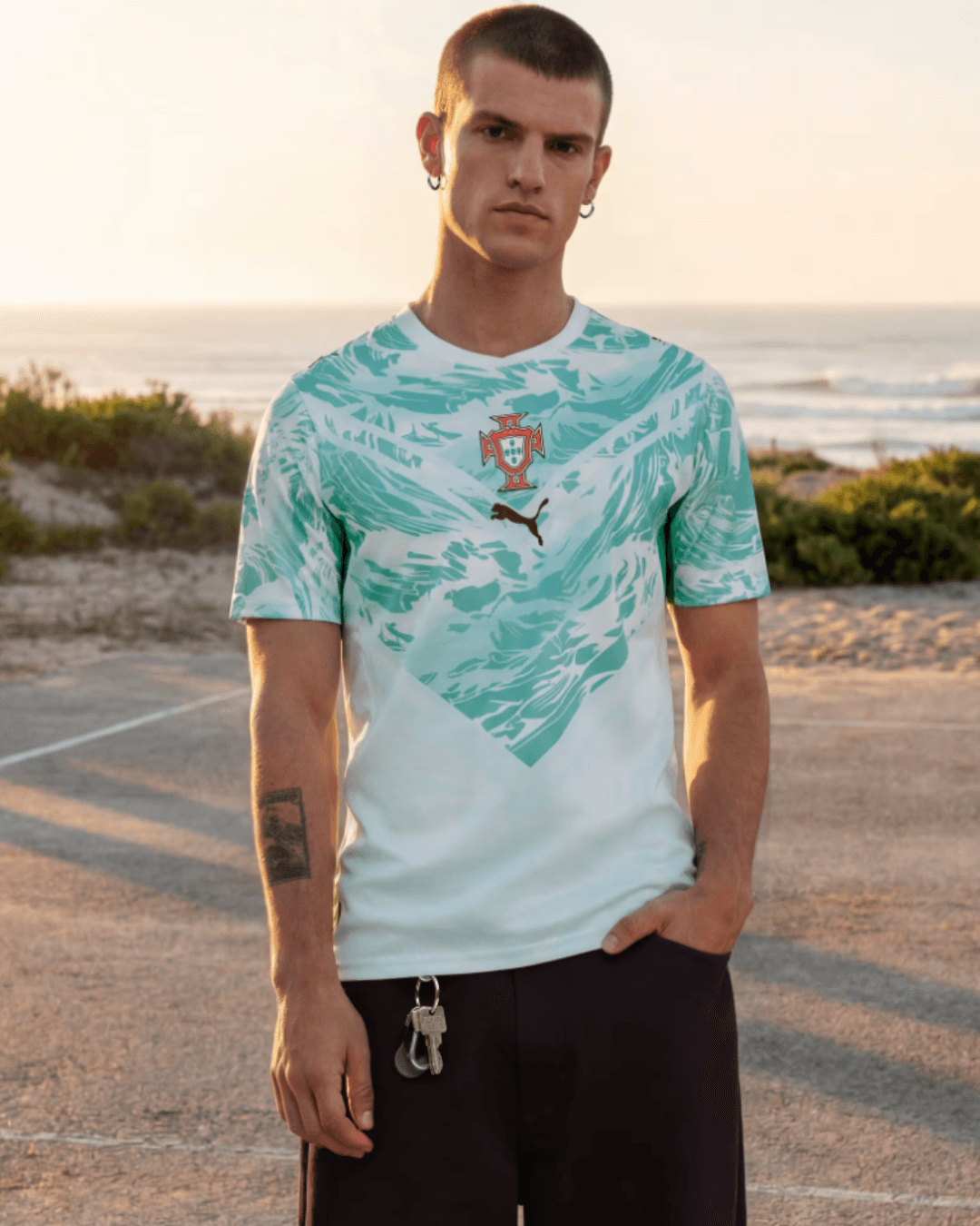
Portugal is a nation that built its identity on the sea — on the explorations of the 15th and 16th centuries, on Vasco da Gama, on Henry the Navigator. No kit could feel more Portuguese than this one.
Portugal's away kit for the 2026 World Cup is predominantly aquamarine, with a graphic pattern across the upper body. The V-cuts on the chest and abdomen blend different shades of aquamarine with white, creating a silhouette that draws from both superhero costumes and the ocean.
Both the home and away designs carry the theme of the sea, expressing it in different ways — through colour tone and graphic form, with the away version taking on a V-shaped silhouette.
Puma's declared concept for this kit is "Connecting Heroes" — a message that ties the players to the country's long tradition of navigators and explorers. An ambitious narrative, and one that finds an elegant, recognisable visual translation in the shirt itself.
This will almost certainly be one of Cristiano Ronaldo's final appearances in an international kit — which adds yet another layer of symbolic weight to this design.
New Zealand – Home kit (Puma): the power of black, the soul of Māori
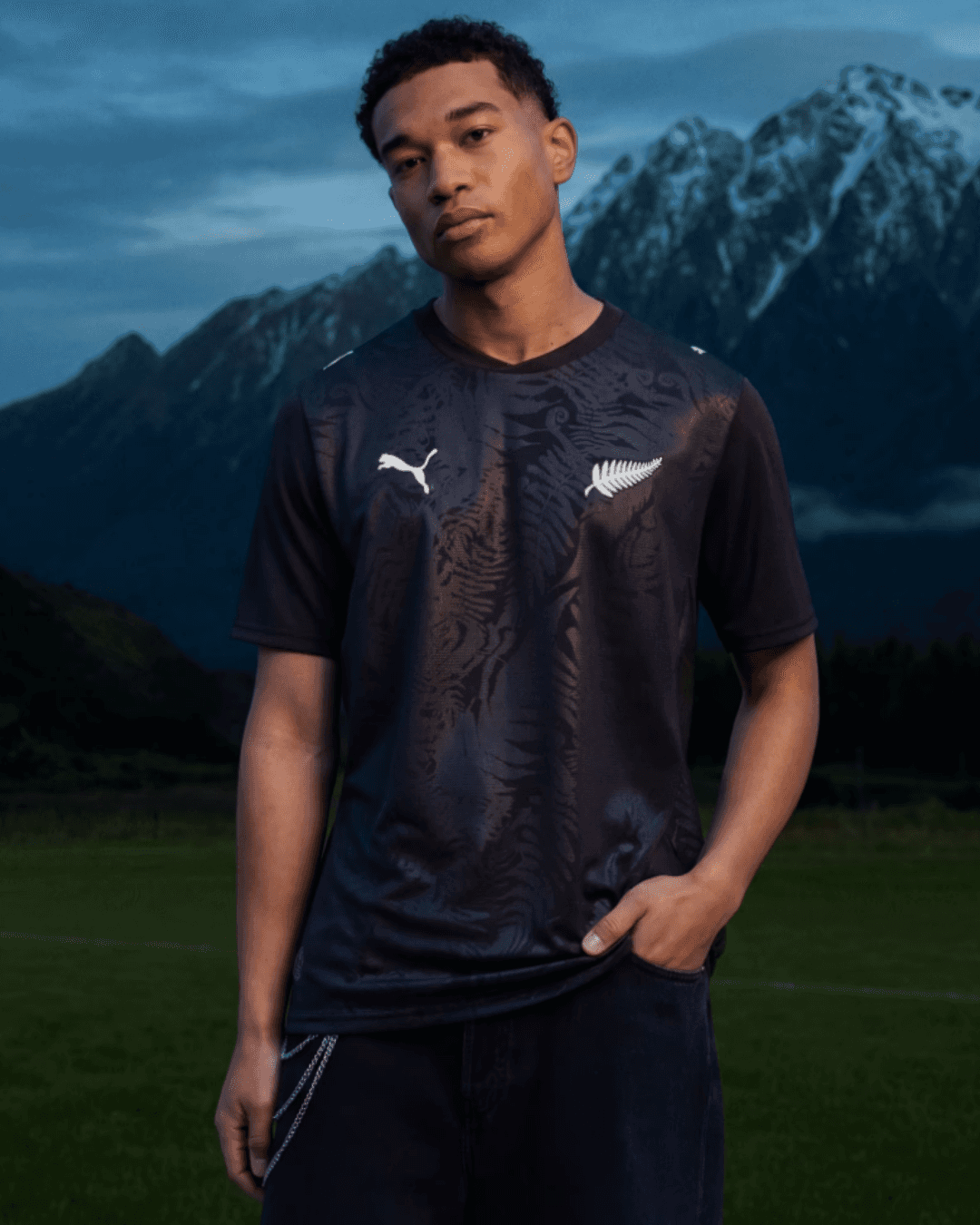
New Zealand has one of the most recognisable symbols in world football: the silver fern. And in this home kit, Puma has found a way to honour it — quietly, but with real impact.
The all-black body comes alive with abstract patterns evoking natural landscapes — ferns, coastlines, volcanic terrain — in a modern, dynamic style. The iconic silver fern on the chest gives the design a clear identity: understated but confident.
The all-black is, of course, a deliberate identity statement. The All Whites — as New Zealand's football team is known — when wearing the dark kit become something closer to the All Blacks of rugby: strength, discipline, belonging to a land.
The elegant black home shirt incorporates a delicate tone-on-tone fern pattern, thematically consistent with the white home kit, which features a spiral graphic inspired by Māori culture and meaning "wind".
This narrative coherence between the two kits is one of the most impressive aspects of Puma's New Zealand collection: not two separate shirts, but a unified visual system telling the same story through two different visual languages.
Mexico – Home kit (Adidas): a tribute to France '98
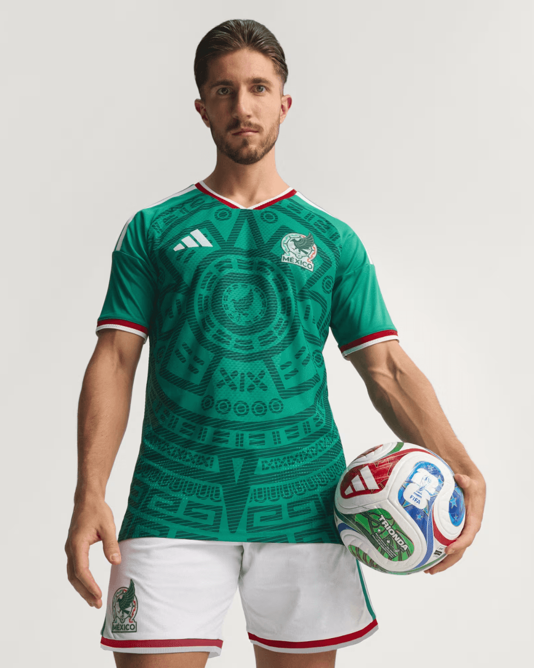
Anyone who followed world football in the late '90s probably remembers Mexico's kit at the 1998 World Cup in France — a bold Aztec pattern on a green base that turned heads for its originality. The 2026 kit is an explicit homage to that cult shirt.
The Adidas kit for Mexico 2026 pays direct tribute to the 1998 design, with a bold all-over Aztec pattern, the classic green base, and "Somos México" on the back collar, following Adidas's new 2026 template with a two-tone collar and thicker stripes.
The base is the iconic green, but what really catches the eye is the Aztec pattern covering the entire front of the shirt — a direct nod to the jersey worn at the French World Cup.
This isn't a nostalgic replica, though. Adidas has worked with a sharper, more intricate design than the original — tighter geometry and a visual finish that benefits from nearly thirty years of evolution in materials and printing technology.
The "Somos México" (We Are Mexico) text on the back of the collar is the touch that transforms a sports shirt into a statement of identity. In a World Cup that Mexico itself is co-hosting, the message lands with precision.
Uruguay – Away kit (Nike): the warrior of 1930
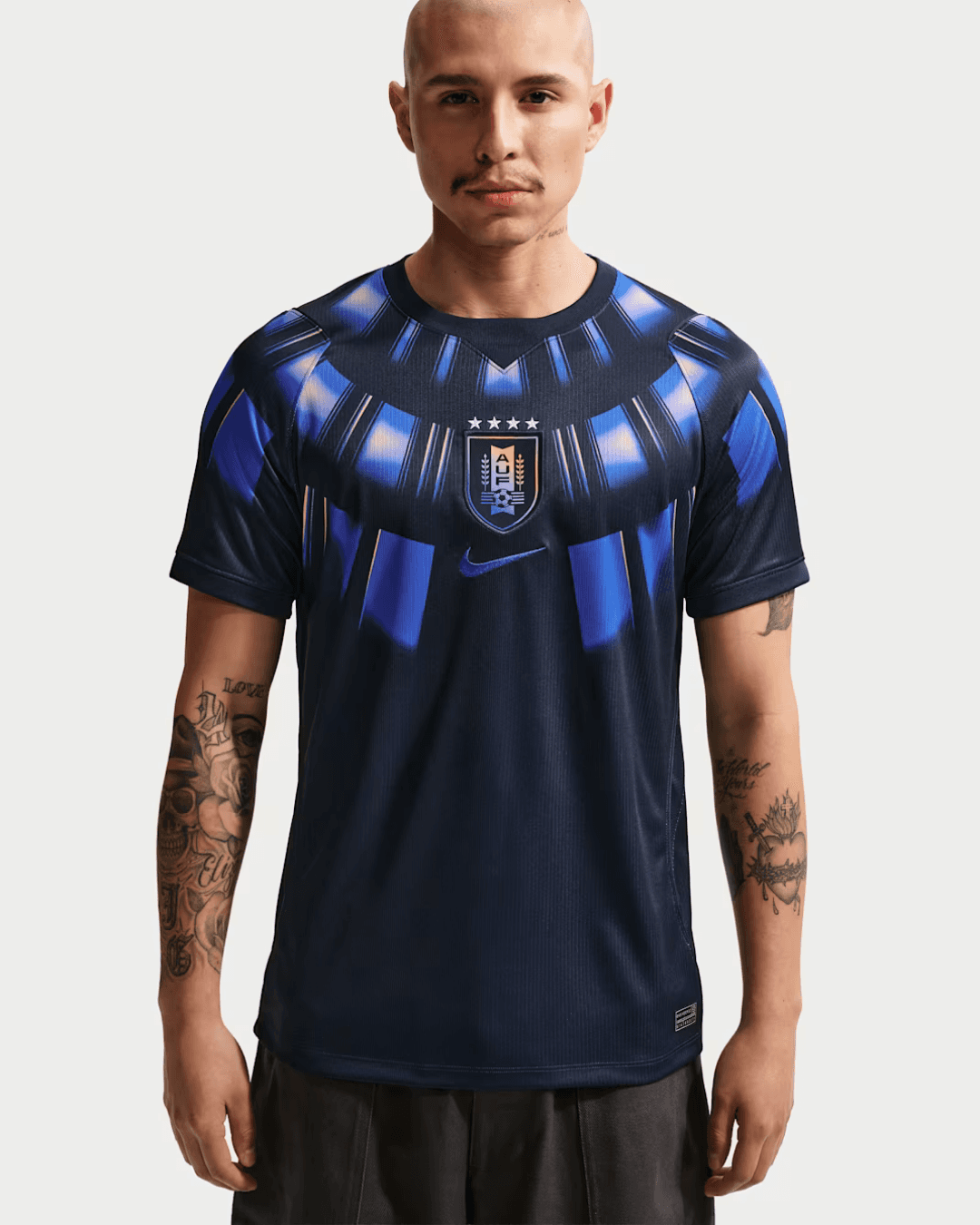
This is probably the most talked-about shirt in the entire tournament. At first glance it looks like it was inspired by a Marvel superhero — and many have nicknamed it the "Black Panther kit". The real story is even more interesting.
Uruguay's away kit for the 2026 World Cup features a bold, futuristic design with a deep navy base and vivid electric-blue patterns across the chest, shoulders and sleeves — evoking the vibrant effect of vibranium from the Black Panther comics and films.
But the real story behind this design runs deeper. Luis Callegari, Nike designer and creative mind behind the shirt, shared a moodboard outlining the concept: the design pays homage to the very first FIFA World Cup in 1930, won by Uruguay itself — visually fusing the stadium and the trophy into a single graphic synthesis.
Uruguay's away kit sits at the top of ESPN's ranking of all 79 kits in the tournament. The contrast between the deep blue and the electric details gives it a futuristic edge — and it reads just as well as a lifestyle piece off the pitch.
This double reading — pop superhero on one level, deep historical tribute on the other — is what makes it extraordinary: a shirt that works on multiple layers, and wears just as well far from the stands.
What do the best kits of 2026 have in common?
Looking at these five shirts together, a common thread emerges that's worth naming.
The most interesting kits of the 2026 World Cup aren't necessarily the loudest ones — they're the ones that build a coherent identity equation between a country's history, its visual imagination, and the language of contemporary design.
Belgium brings surrealism onto the pitch. Portugal tells the story of the ocean. New Zealand celebrates Māori culture. Mexico pays tribute to its own World Cup past. Uruguay honours 1930 with a look from the future.
In all five cases, the brand has put itself in service of the national narrative — not the other way around. And that's the difference between a shirt that sells and a shirt that stays.
Don't call them jerseys
The best kits of the 2026 World Cup prove that sports design, when done right, is capable of telling stories that go well beyond the final whistle. These are cultural artefacts — condensing identity, history and aesthetic vision into a garment that millions of people wear, collect and remember.
If design interests you — not just the sporting kind — our blog has in-depth pieces on how brands build their visual identity through ambitious communication projects. From photography to video, all the way to the kits that end up on pitches around the world, the narrative logic is always the same.
LISTENING IS THE FIRST CHAPTER OF EVERY STORY.
And we can’t wait to write yours.
LISTENING IS THE FIRST CHAPTER OF EVERY STORY.
And we can’t wait to write yours.
Contacts
sixeleven srl sb
Largo Montebello 40/M
10124 Turin - Italy
TAX Code / VAT Number 10182610013
Certificazione ISO 9001:2015 - Certificate ID: 002181-1-IT-1-QMS
GET IN TOUCH —
Contacts
sixeleven srl sb
Largo Montebello 40/M
10124 Turin - Italy
TAX Code / VAT Number 10182610013
Certificazione ISO 9001:2015 - Certificate ID: 002181-1-IT-1-QMS
GET IN TOUCH —
Le maglie più belle dei Mondiali 2026: cinque divise che fanno già storia
Trends
Introduction
Some people watch the World Cup for the goals, some for the tactical drama. We watch it for the kits.
And the 2026 World Cup doesn't disappoint on that front: brands like Adidas, Nike and Puma have turned national jerseys into genuine cultural statements, where design speaks to the history, landscapes and identity of each country.
In this article, we've picked five kits that, in our view, hit harder than the rest. Not just pieces of sportswear — objects that actually say something, and say it with a style that works well beyond the pitch.
The design of World Cup kits: why it matters more than ever
A football shirt isn't just a uniform. It's the primary visual vehicle through which a national team presents itself to the entire world — for a month, in front of billions of viewers.
It's no coincidence that in recent years the major sportswear brands have turned national kits into full editorial projects: every colour choice, every graphic motif, every typographic detail tells you something about the nation it represents.
The 2026 World Cup, hosted across the USA, Mexico and Canada, is no exception. Several brands have put forward collections where the aesthetic dimension is inseparable from the narrative one.
The result? A parallel competition — one of design — that kicks off before the opening whistle.
Belgium – Away kit (Adidas): Magritte takes the pitch
If there's one shirt that perfectly captures the idea of "national identity translated into fabric", it's this one.
Belgium's away kit for the 2026 World Cup features a sky-blue design — called Frozen Blue — with a spherical block pattern and carbon, white and light pink details.
The overall effect calls to mind soap bubbles, or more precisely, spheres floating in an undefined space.
A surrealist aesthetic — and not by accident. The detail that sparked the most conversation is the slogan printed on the inside of the collar of the replica version. It's a clever play on words inspired by René Magritte's famous surrealist work, "The Treachery of Images." The authentic version worn by players doesn't feature this element, due to strict FIFA equipment regulations.
This is exactly the kind of detail that sets a shirt apart from a plain sports uniform. Adidas has explicitly stated that the kit draws inspiration from Belgium's rich artistic heritage, blending surrealist motifs with iconic elements from the national crest.
Belgium — nicknamed the Red Devils — goes in a completely different aesthetic direction with their away kit. A bold choice, and one that works: the country's artistic dimension is brought onto the pitch with a coherence that's hard to find elsewhere.
Portugal – Away kit (Puma): the ocean suits up
Portugal is a nation that built its identity on the sea — on the explorations of the 15th and 16th centuries, on Vasco da Gama, on Henry the Navigator. No kit could feel more Portuguese than this one.
Portugal's away kit for the 2026 World Cup is predominantly aquamarine, with a graphic pattern across the upper body. The V-cuts on the chest and abdomen blend different shades of aquamarine with white, creating a silhouette that draws from both superhero costumes and the ocean.
Both the home and away designs carry the theme of the sea, expressing it in different ways — through colour tone and graphic form, with the away version taking on a V-shaped silhouette.
Puma's declared concept for this kit is "Connecting Heroes" — a message that ties the players to the country's long tradition of navigators and explorers. An ambitious narrative, and one that finds an elegant, recognisable visual translation in the shirt itself.
This will almost certainly be one of Cristiano Ronaldo's final appearances in an international kit — which adds yet another layer of symbolic weight to this design.
New Zealand – Home kit (Puma): the power of black, the soul of Māori
New Zealand has one of the most recognisable symbols in world football: the silver fern. And in this home kit, Puma has found a way to honour it — quietly, but with real impact.
The all-black body comes alive with abstract patterns evoking natural landscapes — ferns, coastlines, volcanic terrain — in a modern, dynamic style. The iconic silver fern on the chest gives the design a clear identity: understated but confident.
The all-black is, of course, a deliberate identity statement. The All Whites — as New Zealand's football team is known — when wearing the dark kit become something closer to the All Blacks of rugby: strength, discipline, belonging to a land.
The elegant black home shirt incorporates a delicate tone-on-tone fern pattern, thematically consistent with the white home kit, which features a spiral graphic inspired by Māori culture and meaning "wind".
This narrative coherence between the two kits is one of the most impressive aspects of Puma's New Zealand collection: not two separate shirts, but a unified visual system telling the same story through two different visual languages.
Mexico – Home kit (Adidas): a tribute to France '98
Anyone who followed world football in the late '90s probably remembers Mexico's kit at the 1998 World Cup in France — a bold Aztec pattern on a green base that turned heads for its originality. The 2026 kit is an explicit homage to that cult shirt.
The Adidas kit for Mexico 2026 pays direct tribute to the 1998 design, with a bold all-over Aztec pattern, the classic green base, and "Somos México" on the back collar, following Adidas's new 2026 template with a two-tone collar and thicker stripes.
The base is the iconic green, but what really catches the eye is the Aztec pattern covering the entire front of the shirt — a direct nod to the jersey worn at the French World Cup.
This isn't a nostalgic replica, though. Adidas has worked with a sharper, more intricate design than the original — tighter geometry and a visual finish that benefits from nearly thirty years of evolution in materials and printing technology.
The "Somos México" (We Are Mexico) text on the back of the collar is the touch that transforms a sports shirt into a statement of identity. In a World Cup that Mexico itself is co-hosting, the message lands with precision.
Uruguay – Away kit (Nike): the warrior of 1930
This is probably the most talked-about shirt in the entire tournament. At first glance it looks like it was inspired by a Marvel superhero — and many have nicknamed it the "Black Panther kit". The real story is even more interesting.
Uruguay's away kit for the 2026 World Cup features a bold, futuristic design with a deep navy base and vivid electric-blue patterns across the chest, shoulders and sleeves — evoking the vibrant effect of vibranium from the Black Panther comics and films.
But the real story behind this design runs deeper. Luis Callegari, Nike designer and creative mind behind the shirt, shared a moodboard outlining the concept: the design pays homage to the very first FIFA World Cup in 1930, won by Uruguay itself — visually fusing the stadium and the trophy into a single graphic synthesis.
Uruguay's away kit sits at the top of ESPN's ranking of all 79 kits in the tournament. The contrast between the deep blue and the electric details gives it a futuristic edge — and it reads just as well as a lifestyle piece off the pitch.
This double reading — pop superhero on one level, deep historical tribute on the other — is what makes it extraordinary: a shirt that works on multiple layers, and wears just as well far from the stands.
What do the best kits of 2026 have in common?
Looking at these five shirts together, a common thread emerges that's worth naming.
The most interesting kits of the 2026 World Cup aren't necessarily the loudest ones — they're the ones that build a coherent identity equation between a country's history, its visual imagination, and the language of contemporary design.
Belgium brings surrealism onto the pitch. Portugal tells the story of the ocean. New Zealand celebrates Māori culture. Mexico pays tribute to its own World Cup past. Uruguay honours 1930 with a look from the future.
In all five cases, the brand has put itself in service of the national narrative — not the other way around. And that's the difference between a shirt that sells and a shirt that stays.
Don't call them jerseys
The best kits of the 2026 World Cup prove that sports design, when done right, is capable of telling stories that go well beyond the final whistle. These are cultural artefacts — condensing identity, history and aesthetic vision into a garment that millions of people wear, collect and remember.
If design interests you — not just the sporting kind — our blog has in-depth pieces on how brands build their visual identity through ambitious communication projects. From photography to video, all the way to the kits that end up on pitches around the world, the narrative logic is always the same.
LISTENING IS THE FIRST CHAPTER OF EVERY STORY.
And we can’t wait to write yours.
LISTENING IS THE FIRST CHAPTER OF EVERY STORY.
And we can’t wait to write yours.
Contacts
sixeleven srl sb
Largo Montebello 40/M
10124 Turin - Italy
TAX Code / VAT Number 10182610013
Certificazione ISO 9001:2015 - Certificate ID: 002181-1-IT-1-QMS
GET IN TOUCH —