We've selected the best rebranding campaigns in recent years - and we'll explain why
Focus

Intro
Most people change their hair when they want a fresh start. Companies, though, prefer rebranding.
Overhauling your logo, tone of voice and positioning can feel like a leap into the void. Often, it can go terribly wrong (a nod to Jaguar).
Fortunately, not all rebranding efforts end in disaster: a solid brand strategy can turn a brand's trajectory from decline to renewed glory. The trick is putting your trust in the right hands. In this article, we've decided to walk you through some stellar examples, where rebranding worked flawlessly and changed the rules of the game in their respective industries.
When does rebranding make sense?
Some companies never change their logo, others reinvent themselves continuously. That's because there's no universal rule on when to rebrand. In itself, it's not a cure-all nor a tool that guarantees growth and prosperity.
Rebranding makes sense when you have a new positioning to communicate, when your activities and target audiences shift. Or, to celebrate a milestone like an important anniversary. Rebranding is a considerable strategic effort, often implemented when it's already too late: just look at Jaguar, which in response to plummeting sales and a major reputation crisis, undertook a massive repositioning that distanced the brand so far from its original values that it disappointed loyalists of a marque that represents a century-long automotive heritage.
Good rebranding, in fact, doesn't distort—it evolves: a balancing act where you innovate, break the mold and grab attention, while remaining authentically true to the characteristics that made a brand famous. A blend of novelty and fidelity to original values, charting new horizons.
This is the criterion we used to select the standout cases in this article: bold, original rebranding efforts, but above all faithful and consistent with each brand's positioning and intent. All while reshuffling the deck not only for competitors, but for industry standards—standards we at sixeleven are proudly part of.
How do you do rebranding right?
We could give you a manual, but we'd rather show you our modus operandi and explain why we love it.
Mozilla: internet for the people.
In an increasingly monopolized digital world, open source solutions are a reclamation of the "old-school" internet: free, open and accessible to everyone.
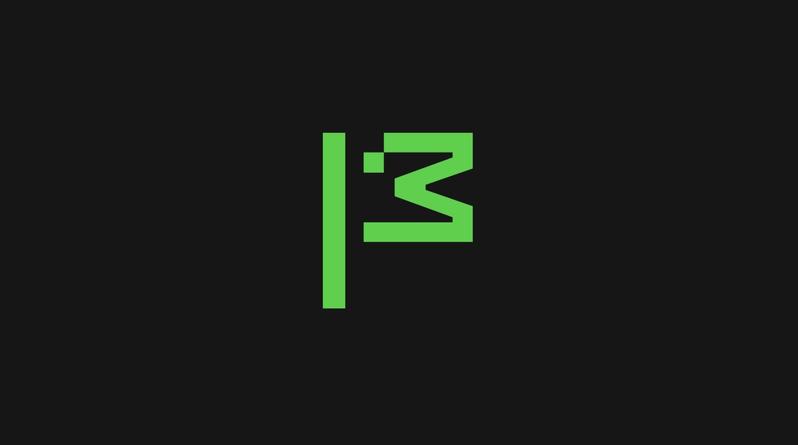
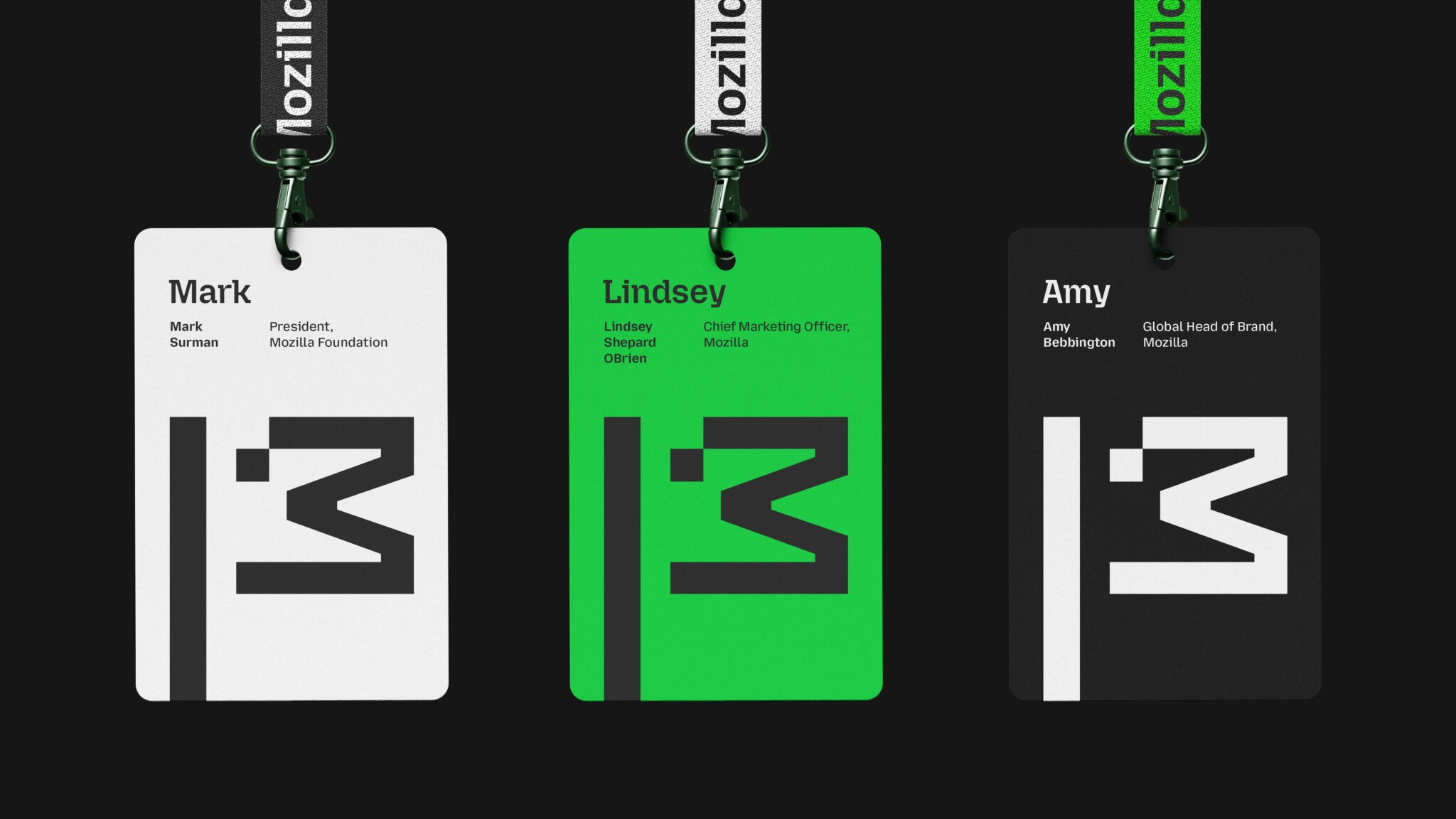
This is the spirit behind Mozilla's rebranding, created by JKR global in 2024. As they define it, both a rebranding and a call to action: reclaiming the internet, in other words, bringing the network back to the status of a common good. Everything in this rebranding evokes the early internet, from the two-tone aesthetic to Mozilla Sans, a custom-made typeface that echoes the typography of 1990s computers. The pinnacle of this rebranding is the new logo: an animated hybrid between the dinosaur, the brand's historic icon, and a flag, symbolizing the activism that the Mozilla Foundation pursues daily for a freer and more accessible internet.
A strategy that hit the mark: brand purpose, brand manifesto and brand personality become aligned, clear and instantly recognizable.
A strategy that has hit the mark: brand purpose, brand manifesto, and brand personality become aligned, clear, and easily recognizable.
Eventbrite: bring people together.
Until recently, Eventbrite was just a simple logo on your concert ticket. But the company wanted to be more: a platform where people could meet through live events. A complete rebranding, created by Buck in 2025, that entirely renewed the Eventbrite ecosystem. The brand abandons functional simplicity to embrace an emotional identity: a place where you discover new interests and meet like-minded people.
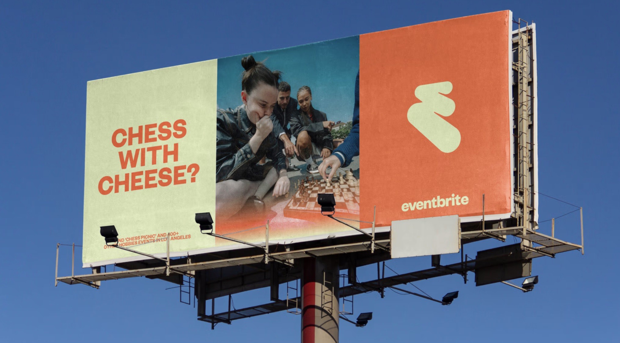
The new brand purpose aligns with a vibrant and charismatic tone of voice, accompanied by a completely transformed visual identity rendered more vibrant through the concept of "Free Flowing Electricity". A bold palette, with orange, green and yellow stealing the show.
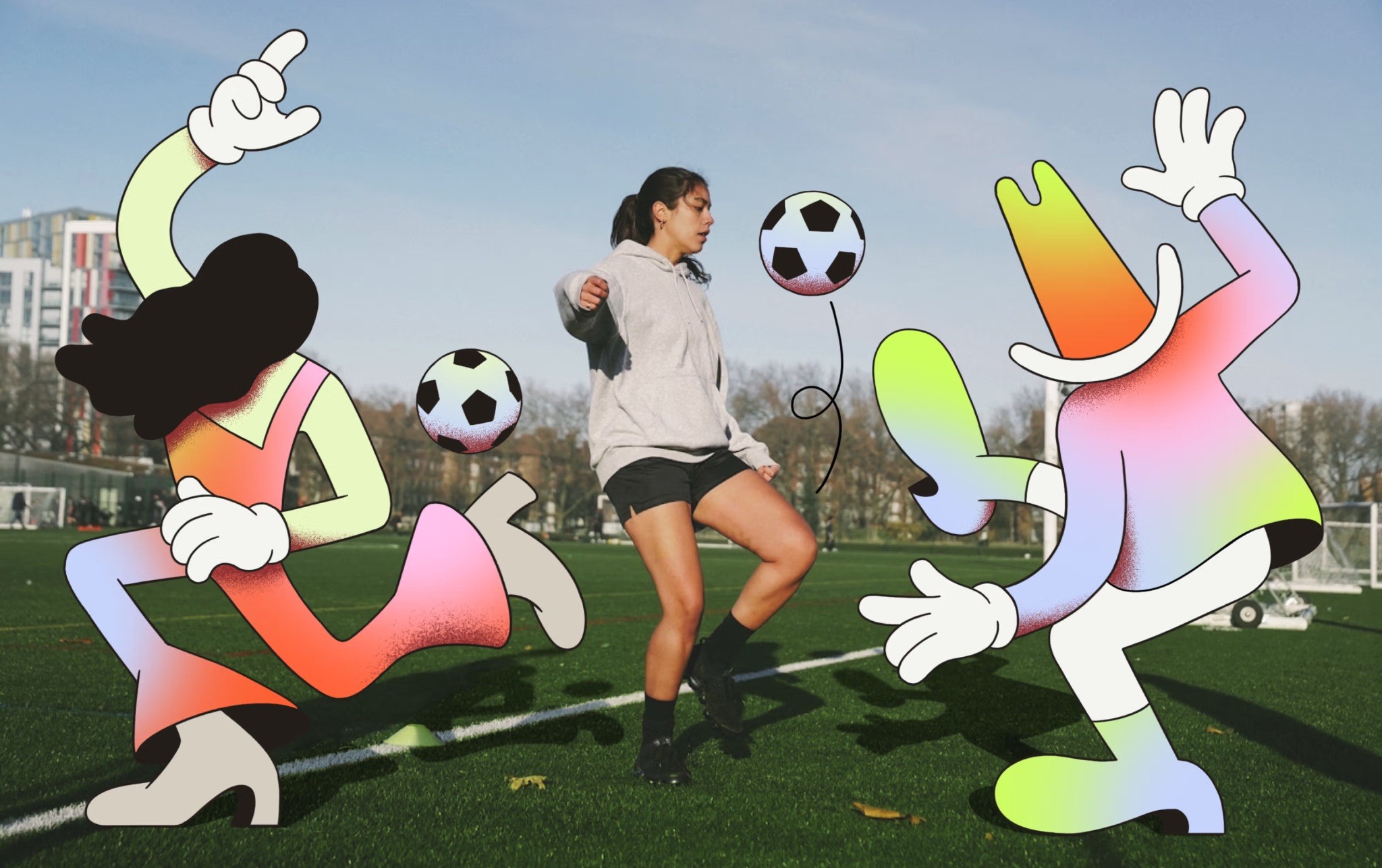
Last but not least, the illustrated mascots that add a touch of charm and fully reflect Eventbrite's renewed personality: a place where people and passions connect in the real world.
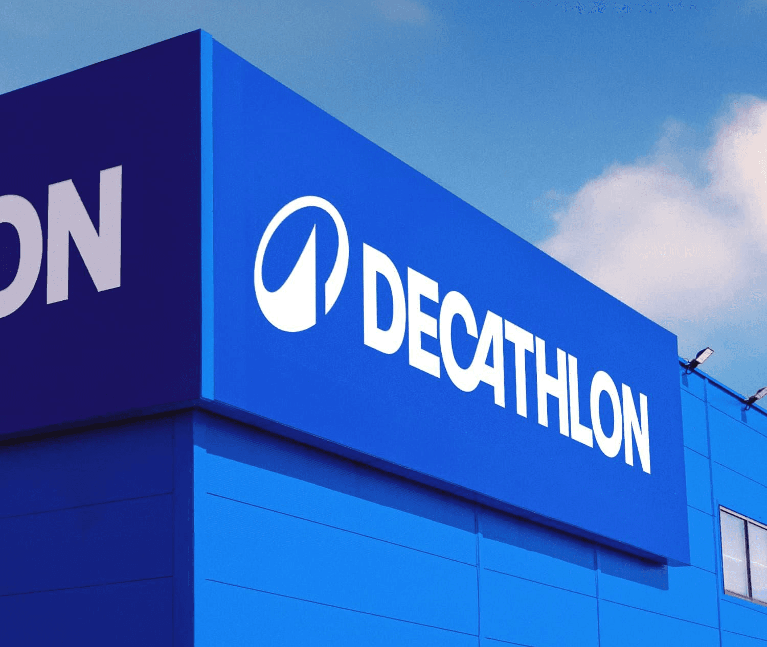
Decathlon: for all sports, all people, and all levels.
The narrative around sports is frankly monotonous: it's always about hard work, sacrifice, results and victories. But what truly draws people to sports is joy and wellbeing, regardless of outcomes. Starting from these premises, Wolff Olins conceived a radical rebranding for Decathlon, which in recent years had been losing market share among younger demographics—precisely those the brand has always targeted.
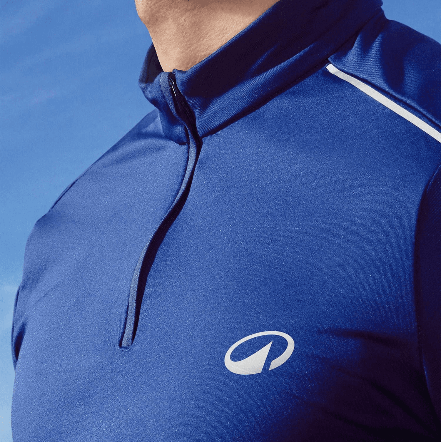
The new Decathlon dismantles sports stereotypes and reaches out to anyone who loves to move, regardless of skill level. Accessibility to sports is what made Decathlon the giant it is today: the new brand identity aims to celebrate the positive emotions that revolve around physical activity.
A new voice that accompanies a visual identity oriented toward movement and dynamism: the new logo, The Orbit, reflects Decathlon's new north star, representing movement and circularity. A symbol with a huge responsibility: to represent and replace all 85 sub-brands in the chain, unifying product lines and rationalizing brand architecture.
Branding the sixeleven way.
In case it wasn't obvious, we love doing branding: it's the primordial activity of communication, where you create from scratch the identity of a company, entity or organization. A collaborative effort to give shape to a vision: from logo to verbal identity, every communications professional is called upon to do their part in building something great.
We start by listening and understanding our client's imagination, embodying their ambitions and rationalizing their fears. We love putting ourselves at the service of those who choose us, accompanying them with our expertise toward success.
One of our recent rebranding projects involved Roser: for its 60th anniversary, the company asked us to refresh its identity.
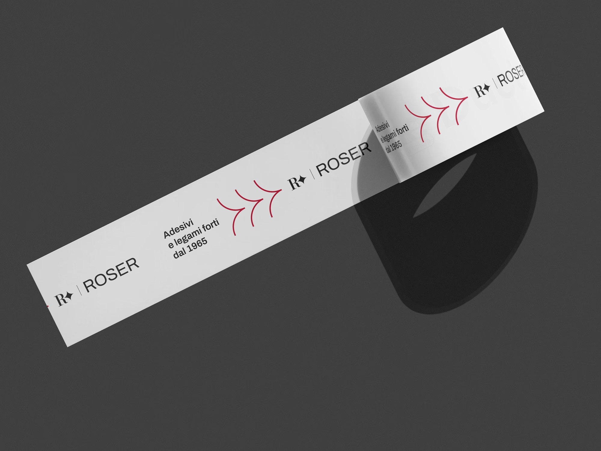
With respect for its roots and history, but with our eyes set on the future, we created a brand identity that shouts from the rooftops: adhesives can be cool too. If you want to dive deeper into the project, we tell the story here.

LISTENING IS THE FIRST CHAPTER OF EVERY STORY.
And we can’t wait to write yours.
LISTENING IS THE FIRST CHAPTER OF EVERY STORY.
And we can’t wait to write yours.
Contacts
sixeleven srl sb
Largo Montebello 40/M
10124 Turin - Italy
TAX Code / VAT Number 10182610013
Certificazione ISO 9001:2015 - Certificate ID: 002181-1-IT-1-QMS
GET IN TOUCH —
Contacts
sixeleven srl sb
Largo Montebello 40/M
10124 Turin - Italy
TAX Code / VAT Number 10182610013
Certificazione ISO 9001:2015 - Certificate ID: 002181-1-IT-1-QMS
GET IN TOUCH —
We've selected the best rebranding campaigns in recent years - and we'll explain why
Focus
Intro
Most people change their hair when they want a fresh start. Companies, though, prefer rebranding.
Overhauling your logo, tone of voice and positioning can feel like a leap into the void. Often, it can go terribly wrong (a nod to Jaguar).
Fortunately, not all rebranding efforts end in disaster: a solid brand strategy can turn a brand's trajectory from decline to renewed glory. The trick is putting your trust in the right hands. In this article, we've decided to walk you through some stellar examples, where rebranding worked flawlessly and changed the rules of the game in their respective industries.
When does rebranding make sense?
Some companies never change their logo, others reinvent themselves continuously. That's because there's no universal rule on when to rebrand. In itself, it's not a cure-all nor a tool that guarantees growth and prosperity.
Rebranding makes sense when you have a new positioning to communicate, when your activities and target audiences shift. Or, to celebrate a milestone like an important anniversary. Rebranding is a considerable strategic effort, often implemented when it's already too late: just look at Jaguar, which in response to plummeting sales and a major reputation crisis, undertook a massive repositioning that distanced the brand so far from its original values that it disappointed loyalists of a marque that represents a century-long automotive heritage.
Good rebranding, in fact, doesn't distort—it evolves: a balancing act where you innovate, break the mold and grab attention, while remaining authentically true to the characteristics that made a brand famous. A blend of novelty and fidelity to original values, charting new horizons.
This is the criterion we used to select the standout cases in this article: bold, original rebranding efforts, but above all faithful and consistent with each brand's positioning and intent. All while reshuffling the deck not only for competitors, but for industry standards—standards we at sixeleven are proudly part of.
How do you do rebranding right?
We could give you a manual, but we'd rather show you our modus operandi and explain why we love it.
Mozilla: internet for the people.
In an increasingly monopolized digital world, open source solutions are a reclamation of the "old-school" internet: free, open and accessible to everyone.
This is the spirit behind Mozilla's rebranding, created by JKR global in 2024. As they define it, both a rebranding and a call to action: reclaiming the internet, in other words, bringing the network back to the status of a common good. Everything in this rebranding evokes the early internet, from the two-tone aesthetic to Mozilla Sans, a custom-made typeface that echoes the typography of 1990s computers. The pinnacle of this rebranding is the new logo: an animated hybrid between the dinosaur, the brand's historic icon, and a flag, symbolizing the activism that the Mozilla Foundation pursues daily for a freer and more accessible internet.
A strategy that hit the mark: brand purpose, brand manifesto and brand personality become aligned, clear and instantly recognizable.
A strategy that has hit the mark: brand purpose, brand manifesto, and brand personality become aligned, clear, and easily recognizable.
Eventbrite: bring people together.
Until recently, Eventbrite was just a simple logo on your concert ticket. But the company wanted to be more: a platform where people could meet through live events. A complete rebranding, created by Buck in 2025, that entirely renewed the Eventbrite ecosystem. The brand abandons functional simplicity to embrace an emotional identity: a place where you discover new interests and meet like-minded people.
The new brand purpose aligns with a vibrant and charismatic tone of voice, accompanied by a completely transformed visual identity rendered more vibrant through the concept of "Free Flowing Electricity". A bold palette, with orange, green and yellow stealing the show.
Last but not least, the illustrated mascots that add a touch of charm and fully reflect Eventbrite's renewed personality: a place where people and passions connect in the real world.
Decathlon: for all sports, all people, and all levels.
The narrative around sports is frankly monotonous: it's always about hard work, sacrifice, results and victories. But what truly draws people to sports is joy and wellbeing, regardless of outcomes. Starting from these premises, Wolff Olins conceived a radical rebranding for Decathlon, which in recent years had been losing market share among younger demographics—precisely those the brand has always targeted.
The new Decathlon dismantles sports stereotypes and reaches out to anyone who loves to move, regardless of skill level. Accessibility to sports is what made Decathlon the giant it is today: the new brand identity aims to celebrate the positive emotions that revolve around physical activity.
A new voice that accompanies a visual identity oriented toward movement and dynamism: the new logo, The Orbit, reflects Decathlon's new north star, representing movement and circularity. A symbol with a huge responsibility: to represent and replace all 85 sub-brands in the chain, unifying product lines and rationalizing brand architecture.
Branding the sixeleven way.
In case it wasn't obvious, we love doing branding: it's the primordial activity of communication, where you create from scratch the identity of a company, entity or organization. A collaborative effort to give shape to a vision: from logo to verbal identity, every communications professional is called upon to do their part in building something great.
We start by listening and understanding our client's imagination, embodying their ambitions and rationalizing their fears. We love putting ourselves at the service of those who choose us, accompanying them with our expertise toward success.
One of our recent rebranding projects involved Roser: for its 60th anniversary, the company asked us to refresh its identity.
With respect for its roots and history, but with our eyes set on the future, we created a brand identity that shouts from the rooftops: adhesives can be cool too. If you want to dive deeper into the project, we tell the story here.
LISTENING IS THE FIRST CHAPTER OF EVERY STORY.
And we can’t wait to write yours.
LISTENING IS THE FIRST CHAPTER OF EVERY STORY.
And we can’t wait to write yours.
Contacts
sixeleven srl sb
Largo Montebello 40/M
10124 Turin - Italy
TAX Code / VAT Number 10182610013
Certificazione ISO 9001:2015 - Certificate ID: 002181-1-IT-1-QMS
GET IN TOUCH —